Show the code
library(tidyverse)
library(sf)
library(httr)
library(gganimate)
library(patchwork)
library(ggtext)Isaac Bain
June 10, 2024
GeoNet is a partnernship between Toka Tū Ake EQC, GNS Science, and Land Information New Zealand (LINZ) which has been around since 2001. It is a geological hazard monitoring system that uses a network of geophysical instruments to detect earthquakes, volcanic activity, large landslides, tsunami, and slow-slip events that precede large earthquakes.
They make their data available in a number of API formats. Here, I use a Web Feature Service (WFS) to query the GeoNet Earthquake Catalogue for earthquakes that happened (1) last year, (2) were greater than magnitude one, (3) occurred in or near New Zealand.
The API bypasses the CSV download limit on their website, and the data can be directly read into R as a Simple Features (sf) spatial object.
Libraries
Download data
wfs_url <- "https://wfs.geonet.org.nz/geonet/ows"
type_name <- "geonet:quake_search_v1"
output_format <- "json"
cql_filter <- "origintime>='2023-01-01T00:00:00.000Z' AND origintime<'2024-01-01T00:00:00.000Z' AND magnitude>1.5"

query_url <- paste0(
  wfs_url,
  "?service=WFS&version=1.0.0&request=GetFeature&typeName=", type_name,
  "&outputFormat=", output_format,
  "&cql_filter=", URLencode(cql_filter)
)

earthquakes_sf <- st_read(query_url) |> st_transform(2193)

coastline <- st_read("data/coastline_simplified/nz-coastlines-and-islands-polygons-topo-150k.shp", crs = 2193)
Crop data
Firstly, let’s examine the distribution of earthquake depths and magnitudes (Figure 1). It’s evident that there are more shallow earthquakes than deep ones, and more small earthquakes than large ones.
plot_depth <- ggplot(earthquakes_nz_sf, aes(x = depth)) +
  geom_histogram(aes(fill = ..x..), bins = 30, color = "black", alpha = 0.7) +
  theme_minimal() +
  labs(
    title = "Distribution of Depths",
    x = "Depth (km)",
    y = "Count"
  ) +
  scale_fill_viridis_c(option = "inferno", direction = -1) +
  theme(
    axis.text.x = element_text(vjust = 0.5, hjust = 0.5),
    legend.position = "bottom",
    legend.title = element_blank()
  )

bin_data <- earthquakes_nz_sf %>%
  mutate(bin = cut(magnitude, breaks = seq(min(magnitude), max(magnitude), length.out = 31), include.lowest = TRUE)) %>%
  group_by(bin) %>%
  summarise(
    magnitude = mean(magnitude),
    count = n(),
    magnitude_exp = mean(exp(magnitude))
  )

plot_magnitude <- ggplot(earthquakes_nz_sf, aes(x = magnitude)) +
  geom_histogram(aes(y = ..count..), bins = 30, fill = "darkslateblue", color = "black", alpha = 0.7) +
  # geom_point(data = bin_data, aes(x = magnitude, y = count, size = magnitude_exp),
  #            color = "black", alpha = 0.5) +
  theme_minimal() +
  labs(
    title = "Distribution of Magnitudes",
    x = "Magnitude",
    y = "Count"
  ) +
  scale_x_continuous(
    breaks = c(1, 2, 3, 4, 5, 6, 7),
    labels = c("1\nUnnoticeable", "2\nUnnoticeable", "3\nWeak", "4\nLight", "5\nModerate", "6\nStrong", "7\nSevere")
  ) +
  scale_size_continuous(
    name = "Magnitude",
    range = c(3, 15),
    breaks = exp(c(3, 4, 5, 6)),
    labels = c("≤ 3", 4, 5, "≥ 6")
  ) +
  theme(
    axis.text.x = element_text(vjust = 0.5, hjust = 0.5),
    legend.position = "bottom",
    legend.title = element_blank()
  )

plot_depth + plot_magnitude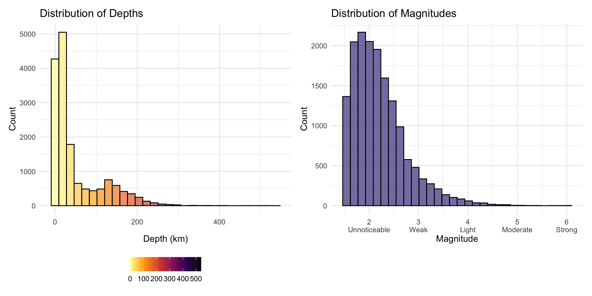
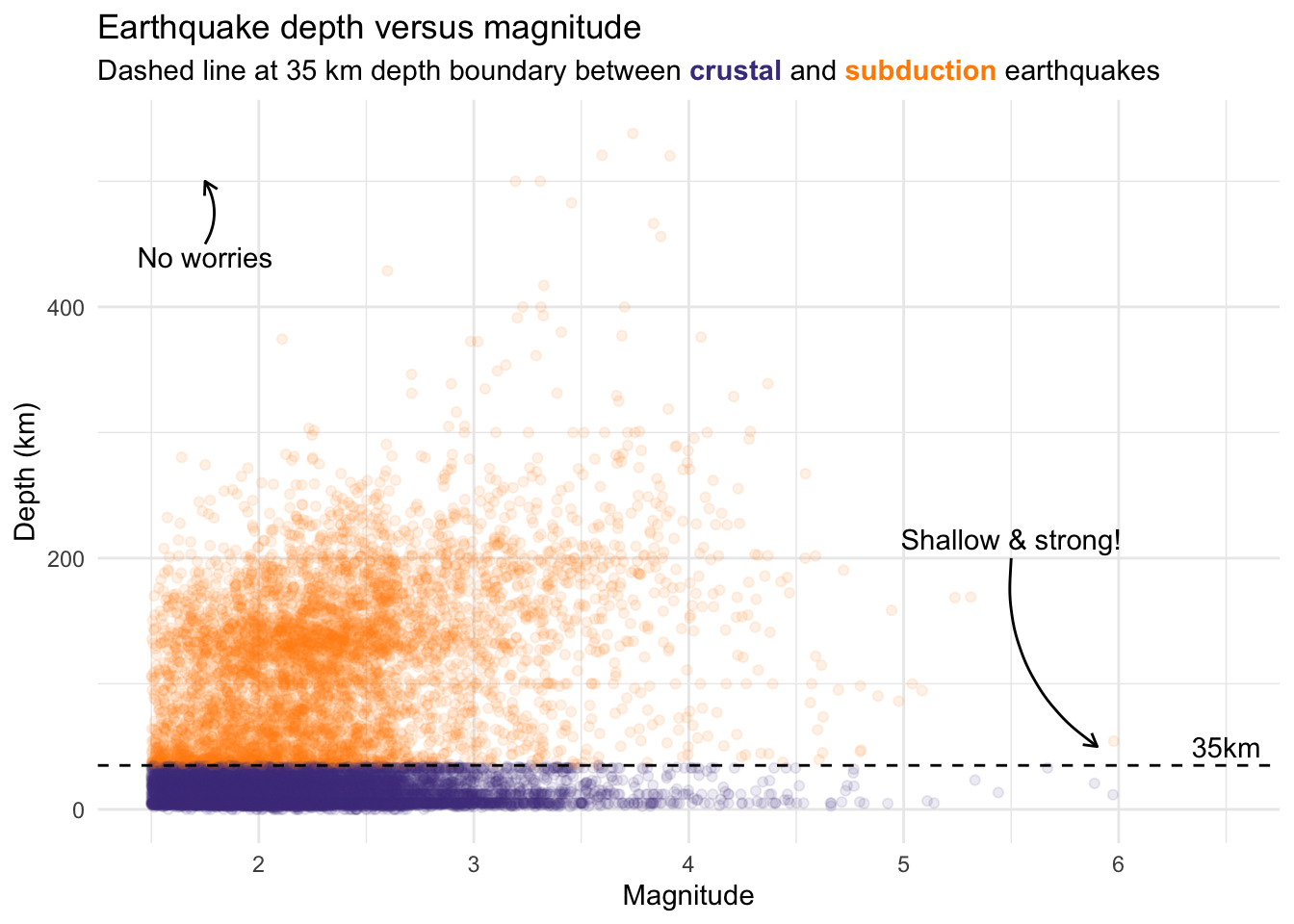
Let’s take this one step further and examine the relationship between depth and magnitude (Figure 2). Large, shallow earthquakes are the most dangerous, causing significant damage. Whilst, small, deep earthquakes are less likely to be felt by people, and there are few of these in the dataset—possibly because they are harder for seismometers to detect.
ggplot(data = earthquakes_nz_sf, aes(magnitude, depth)) +
    geom_point(aes(color = depth > 35), alpha = 0.1) +
  scale_color_manual(values = c("TRUE" = "darkorange", "FALSE" = "darkslateblue")) +
  geom_hline(yintercept = 35, linetype = "dashed") +
  theme_minimal() +
  labs(
    x = "Magnitude",
    y = "Depth (km)",
    title = "Earthquake depth versus magnitude",
    subtitle = "Dashed line at 35 km depth boundary between <span style='color:darkslateblue;'><b>crustal</b></span> and <span style='color:darkorange;'><b>subduction</b></span> earthquakes"
  ) +
  annotate(
    geom = "curve", x = 5.5, y = 200, xend = 5.9, yend = 50,
    curvature = .3, arrow = arrow(length = unit(2, "mm"))
  ) +
  annotate(geom = "text", x = 5.5, y = 215, label = "Shallow & strong!", hjust = "center") +
  annotate(
    geom = "curve", x = 1.75, y = 450, xend = 1.75, yend = 500,
    curvature = .3, arrow = arrow(length = unit(2, "mm"))
  ) +
  annotate(geom = "text", x = 1.75, y = 440, label = "No worries", hjust = "center") +
  annotate(geom = "text", x = 6.5, y = 50, label = "35km", hjust = "center") +
  theme(
    legend.position = "none",
    plot.subtitle = ggtext::element_markdown()
  )
Deep earthquakes under the North Island form a well-defined line, representing the Hikurangi subduction zone where the Pacific Plate is being forced under the Australian Plate (Figure 3). This pattern, with deeper earthquakes towards the west of the North Island, is the Wadati–Benioff zone.
In contrast, the South Island exhibits a different earthquake pattern, with the Australian Plate being forced under the Pacific Plate. This is the Alpine Fault, a transform fault responsible for the Southern Alps. The deeper earthquakes occur on the southeast edge of the Wadati–Benioff zone, where it dips steeply to the southeast.
# https://www.otago.ac.nz/geology/research/alpine-fault
plot_crustal <- ggplot() +
geom_sf(
data = coastline,
fill = "#839073",
color = NA
) +
geom_sf(
data = earthquakes_nz_sf |> filter(depth < 35),
colour = "darkslateblue",
size = 0.1,
alpha = 0.7
) +
coord_sf(xlim = c(1050000, 2200000), ylim = c(4700000, 6200000)) +
theme_void() +
labs(
title = "<span style='color:darkslateblue'>Crustal</span> earthquakes <br>< 35km deep",
x = "",
y = ""
) +
theme(plot.title = element_markdown(
family = "sans", size = 12, face = "bold", color = "#394053", hjust = 0.5
)) +
annotate(
"curve", x = 1680000, y = 5746015, xend = 1851604, yend = 5703141,
curvature = .3, arrow = arrow(length = unit(2, "mm")), color = "black",
linewidth = 0.25
) +
annotate(
"text", x = 1670000, y = 5746015, label = "Taupō volcanic zone", hjust = "right", color = "black", size = 2.5
) +
annotate(
"curve", x = 1894962, y = 6057348, xend = 1969587, yend = 5839512,
curvature = .3, arrow = arrow(length = unit(2, "mm")), color = "black",
linewidth = 0.25
) +
annotate(
"text", x = 1894962, y = 6057348, label = "Whakaari \nWhite Island", hjust = "centre",
vjust = -0.15, color = "black", size = 2.5
)
plot_subduction <- ggplot() +
geom_sf(
data = coastline,
fill = "#839073",
color = NA
) +
geom_sf(
data = earthquakes_nz_sf |> filter(depth > 35),
aes(color = depth),
size = 0.1,
alpha = 0.7
) +
coord_sf(xlim = c(1050000, 2200000), ylim = c(4700000, 6200000)) +
theme_void() +
labs(
title = "<span style='color:darkorange'>Subduction</span> earthquakes <br>> 35km deep",
x = "",
y = "",
color = "Depth (km)",
size = "Magnitude"
) +
theme(
plot.title = element_markdown(
family = "sans", size = 12, face = "bold", color = "#394053", hjust = 0.5
),
legend.position = "bottom"
) +
scale_color_viridis_c(option = "inferno", direction = -1) +
annotate(
"curve", x = 1680000, y = 5000000, xend = 1450000, yend = 5200000,
curvature = .3, arrow = arrow(length = unit(2, "mm")), color = "black",
linewidth = 0.25
) +
annotate(
"text", x = 1680000, y = 4930000, label = "Notable gap in deep \nearthquakes", hjust = 0.5, color = "black", size = 2.5
)
plot_crustal + plot_subduction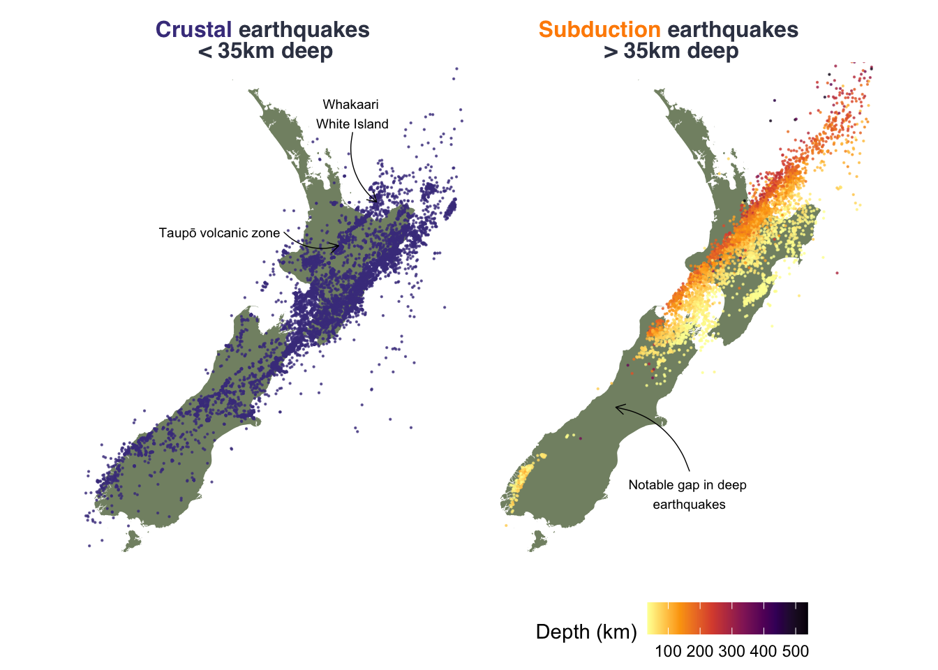
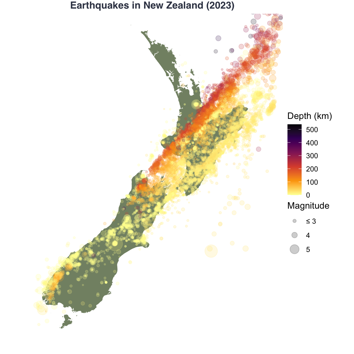
Let’s plot all of the earthquakes on a map of New Zealand (Figure 4). We’ll use the geom_sf function to plot the earthquakes and the coastline. Additionally we’ll use the scale_size_continuous function to adjust the size of the points based on the magnitude of the earthquake, applying an exponential transformation to reflect the disproportionately larger amount of energy released by larger magnitude earthquakes.
ggplot() +
  geom_sf(
    data = coastline,
    fill = "#839073",
    color = NA
  ) +
  geom_sf(
    data = earthquakes_nz_sf,
    aes(color = depth, size = exp(magnitude)),
    alpha = 0.2
  ) +
  scale_size_continuous(
    name = "Magnitude",
    range = c(0.01, 8),
    breaks = exp(c(3, 4, 5, 6)),
    labels = c("≤ 3", 4, 5, "≥ 6")
  ) +
  coord_sf(xlim = c(1050000, 2200000), ylim = c(4700000, 6200000)) +
  theme_void() +
  labs(
    title = "Earthquakes in New Zealand (2023)",
    x = "",
    y = "",
    color = "Depth (km)",
    size = "Magnitude"
  ) +
  theme(plot.title = element_text(
    family = "sans", size = 12, face = "bold", color = "#394053", hjust = 0.5, vjust = 2.5
  )) +
  scale_color_viridis_c(
    option = "inferno",
    direction = -1
  )
Now, to make it animated! We’ll use the gganimate package to create an animated plot of the earthquakes over time (Figure 5). We’ll use the transition_time function to animate the plot over the origintime variable, which is the date of the earthquake. Additionally, we’ll use the shadow_mark function to leave a shadow of the earthquakes that have already occurred.
p <- ggplot() +
  geom_sf(
    data = coastline,
    fill = "#839073",
    color = NA
  ) +
  geom_sf(
    data = earthquakes_nz_sf,
    aes(color = depth, size = exp(magnitude)),
    alpha = 0.4
  ) +
  scale_size_continuous(
    name = "Magnitude",
    range = c(0.01, 6),
    breaks = exp(c(3, 4, 5, 6)),
    labels = c("≤ 3", 4, 5, "≥ 6")
  ) +
  coord_sf(xlim = c(1050000, 2200000), ylim = c(4700000, 6200000)) +
  theme_void() +
  labs(
    title = "Earthquakes in New Zealand (2023)",
    subtitle = "Date: {lubridate::as_date(next_state)}",
    x = "",
    y = "",
    color = "Depth (km)",
    size = "Magnitude"
  ) +
  scale_color_viridis_c(
    option = "inferno",
    direction = -1
  ) +
  theme(
    plot.title = element_text(family = "sans", size = 12, face = "bold", color = "#394053",
                              hjust = 0.5),
    plot.subtitle = element_text(size = 8, hjust = 0.5),
    legend.title = element_text(size = 8)
  ) +
  guides(color = guide_colourbar(reverse = T)) +
  transition_states(origintime, transition_length = 2, state_length = 1) +
  shadow_mark(past = TRUE)

animate(p,
  start_pause = 15,
  end_pause = 60,
  nframes = 300,
  fps = 20,
  res = 300,
  renderer = gifski_renderer()
)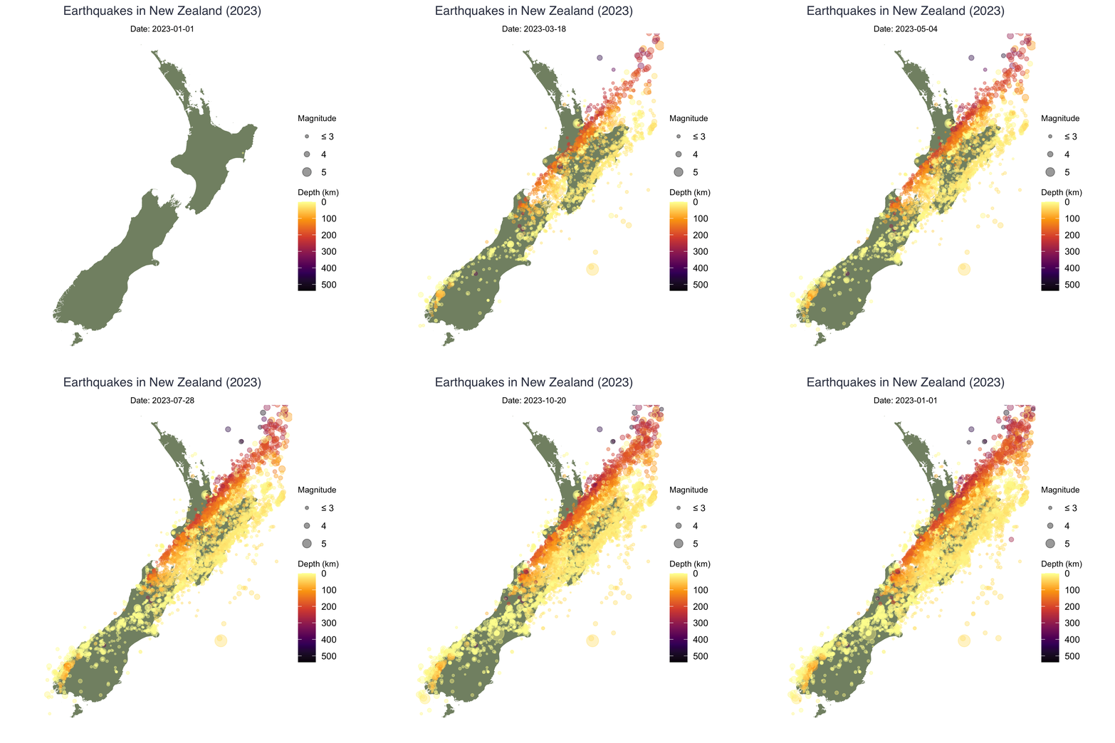
So that’s it! We’ve explored the earthquakes in New Zealand in 2023, focusing on their distribution, the relationship between depth and magnitude, and the spatial patterns relative to tectonic plate boundaries. We’ve created static and animated visualisations to enhance our understanding of the data and effectively communicate our findings.
Next steps could include further analysis of the data, such as: